Tuesday, 25 November 2014
Red Letters
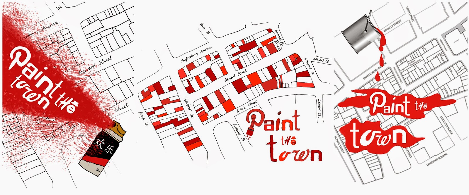
To start off this project, I collected logos that were red and white, then created an alphabet using letters from these logos, which I altered by hand to make them more individual...
Graphics RCA: Fifty Years
Last week I went to the fifty years graphics show at the RCA. I picked a few of my favourites to put on here because, despite the change to modern graphics created in programmes such as Photoshop, I found these more inspiring than some I have seen on bus stops in London.


'American in Paris'-The white silhouettes of the bottles create a really interesting negative space in the red, making the black text seem to stand out far less than that of the 'American in Paris' text.
I like the arrangement of the letters in the second piece, especially how the letter A is in the same font, but has been stretched slightly between each one to make them all different.
For the third, I found the idea of creating a shape with coloured lines intriguing, as the contrast between lighter and darker blues create a sense of a three-dimensional image.
Subscribe to:
Comments (Atom)


