Wednesday, 10 June 2015

Promotional Material

For the banners outside the museum, I created a set of four that work well together as a set. In these, the Natural History Museum logo that I altered using one of my butterflies was much bigger in relation to the text and butterflies, in keeping with the current design layouts.  


For the posters, I wanted to try a few different layouts, for use in places like underground stations and bus stops. I also came up with a slightly different design, using the butterflies to 'spill' out of the poster, making half of their wings outside the designated rectangle so that they can be folded out as if they are escaping to make it three-dimensional. 


Friday, 22 May 2015

Creating the physical butterflies/moths for the final piece

After making butterflies out of as many materials I could think of, I came to the final technique of printing onto acetate and paper, gluing the paper butterfly to the underside of the acetate, then sealing it with a layer of acrylic wax to give a matte finish. This technique also gives me the ability to mould the shape of the wings.
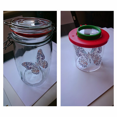
Whilst finalising the final materials and techniques for making the butterflies for the exhibition, I also thought that putting a few in the glass containers would help me to decide on the final scale and how I want them to be displayed. I liked the way that Polly Morgan uses glass cloches to display her taxidermied animals, but I wanted to use more modern containers, to go with the more modernised Victorian theme.
The initial size that I created and cut out were a little too big, as the wings touched the edge of the glass, and they were a little bigger than life-size. I also want to hang multiple different ones in the same tall container, so making them smaller will mean they fit better with the height of the glass holder.


Monday, 18 May 2015

NHM Promotional Material

Part of any exhibition is the advertising beforehand, including promotional material such as posters, banners and leaflets, so that people can get an idea of what it is all about. I wanted to create a series of posters and banners that represent the butterflies and moths, looking at previous posters and other designs for inspiration. To support these, I've also been looking at past leaflets for exhibitions, for what details to include, and to also create a variety of postcards that promote the exhibition after someone had been.
For the type and various possible layouts, I have asked the opinions of a range of people around me, from friends to an outsider who doesn't know anything about the project, to get an objective view. This has helped me to see what works well in my aim to clearly portray what the exhibition is about.


Experimenting with materials

I wanted to find the perfect material for creating the butterflies out of, as I felt that paper or card was too rigid, but also quite boring (unlike the butterflies themselves). In researching into these materials, I looked at transferring the images that I had created onto different surfaces, to maintain the designs as much as possible even at such a small scale.
Initially I printed onto paper, then glued this down onto the wood using Mod Podge. After it had dried, dampening the paper with water enabled me to remove the paper to leave the print still on the wood. Unfortunately this technique didn't work as well as I had hoped, as the colours turned out very faded and not as vibrant as I wanted them to.
I then found another technique where I used wax paper to print the image onto, then pressed this image onto the wood straight away to transfer the ink. This worked better than the other wood transfer technique, and I really liked the outcome but cutting out the shapes would not be as sleek as I would like.
Another material I used was liquid gel, where I added it onto the printed image, put it in the oven to harden it then after cooling, dampen and wipe away the paper to leave the colour image. Unfortunately again, the colour had not been preserved as much as I would like, leaving only the darker colours on the gel, so I won't be using this for the final butterflies.
My favourite so far is the acetate, as the design is visible from both sides, and all of the colours are maintained. The light weight of the acetate is also a good representation, as it mirrors the fragility of the butterflies and moths, drawing towards the main focus of the exhibition.


Tuesday, 12 May 2015

Poly-art

After painting and drawing butterflies, I chose to stick with creating my own geometric designs of butterflies and moths using adobe illustrator. This is my first time using it, so it took me a while to get used to the way of working and using the shortcuts, but I really like the effect that you get from using only triangles, giving a three-dimensional and crystal-like finish. The designs are focused on the fragility of the endangered species, and to emphasise to humans that their beauty could be lost forever.


Wednesday, 6 May 2015

Natural History Museum


I visited the sensational butterflies exhibit to get some first hand photographs of alive butterflies, although these were from Asia, Africa and South America, and I would like to focus on the endangered butterflies that live here in the UK. I particularly like how many of the butterflies have different patterns and colours on one side of the wings to the other, partly as a camouflage, that make them look less colourful when they close up their wings. 


Victorian Collections & The Grant Museum of Zoology

I started off looking into how butterflies were used in the Victorian period, from how they were displayed, to how they were used in objects to create individual pieces such as trays and brooches. Other, more scientific collections were pinned in groups so that they are easy to view and compare.


I also visited the Grant Museum of Zoology, where they had a few butterflies and moths pinned and displayed in small boxes, as it was a very small collection, most of which were encased in different boxes, varying in size and material.


Monday, 20 April 2015

Magnificent Obsessions @ the Barbican


I was drawn to this exhibition after wanting to know what sort of unusual collections artists themselves kept, and if these had an obvious connection to the work that they produce. Having a small collection of turtle figures and other things featuring images of this animal myself, I felt like I could relate to the array of 'knik knaks' like the elephants owned by Peter Blake. The parallels between the artist and their items were sometimes easier to understand than others, but it is hard to fully understand why these artists acquired and saved these objects, photos and the like, without asking them to explain in their own words. 


The first artist that intrigued me on entering the exhibition was Damien Hirst. His 'fascination with the delicate balance between life an death' is not dissimilar to his most famous works, but this enchantment of his also reached out to me as a person, and admirer of animals. The links to the clinical display of Victorian collectors and the lack of sentimentality about the loss of life are powerful and thought-provoking, something that needs to be done to reinforce morals that I feel have somehow been lost in humans that do terrible things such as poaching. Linking to his taxidermied works, the pieces in this exhibition signify his obsession with preventing anything from being affected by time, making it seem immortal whilst also looking into physical decay. 


In the following room, were a mixture of images and Japanese woodblock prints collected by Sol LeWitt. The combination of the vibrant colours of the woodblocks and the black and white modernist photography framed works gave a strong sense of his interests and the way he approached photography. Whilst serving in the US army during the Korean War, LeWitt acquired these nineteenth-century woodblocks from Japan, making these some of the earliest parts of his belongings. I particularly liked the flattened forms that the outlined images create, so would like to explore printmaking further in this project.  This contrasts to his documentation of the architectural details and possessions in his Manhattan loft, arranged in grids of nine square black and white photos.
The collections of some bizarre and beautiful pieces have been described as both addictive and exciting, which is something I feel like I can start to understand myself through sorting out my own belongings. Every item holds memories that are significant to me, so they act as reminders of places I've been to or the people that gave them to me. The idea of collecting items, ranging from art to memorabilia, always seems to be a variety of things that please the eye, maybe not to everyone, but they show the tastes and sometimes even inspiration of what makes us tick as a person or an artist.